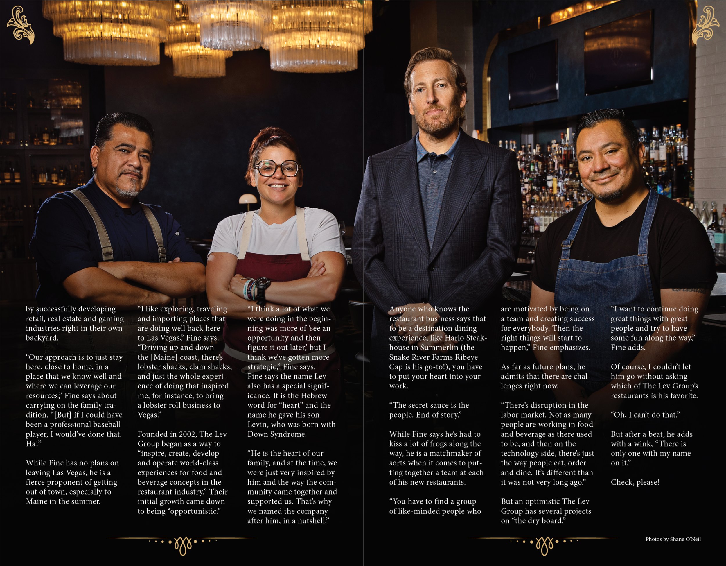
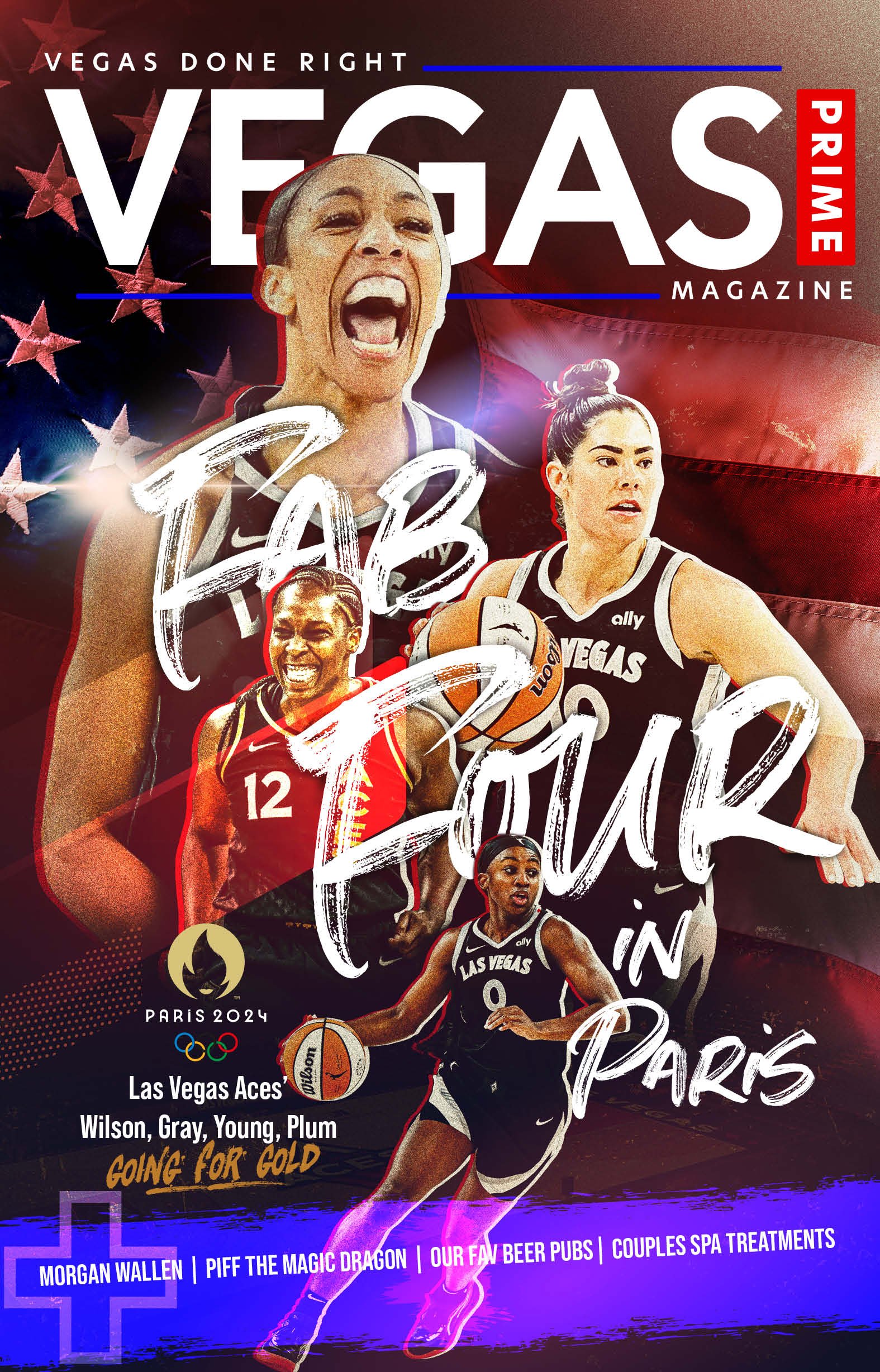
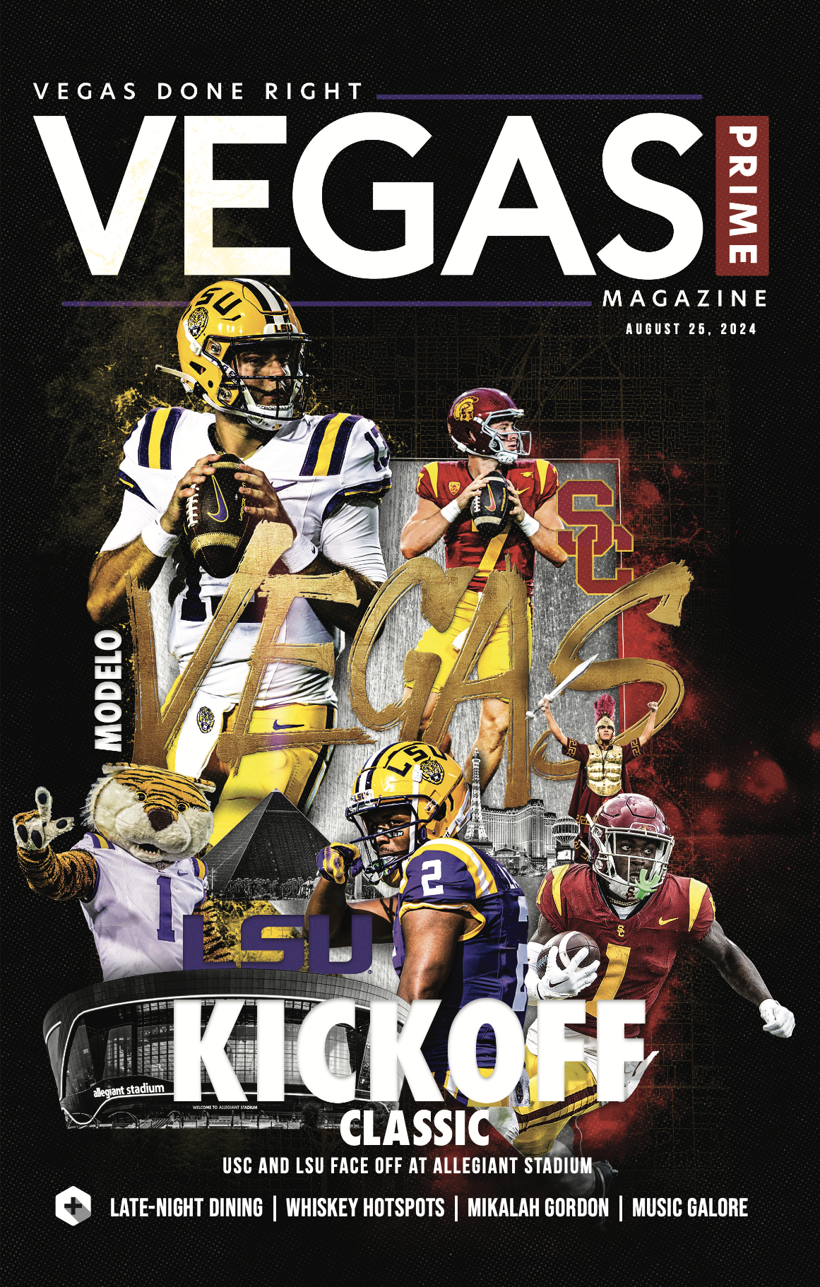
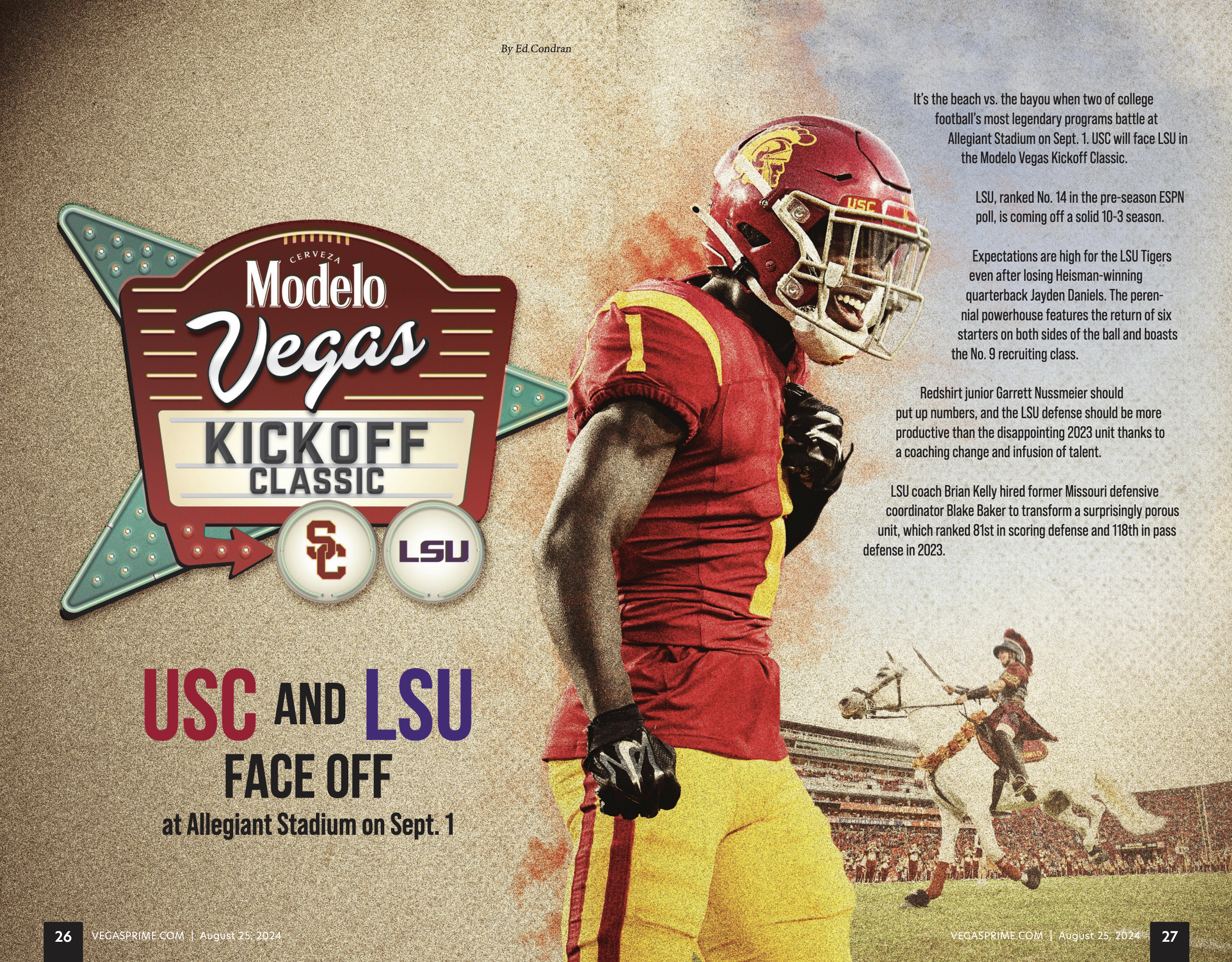
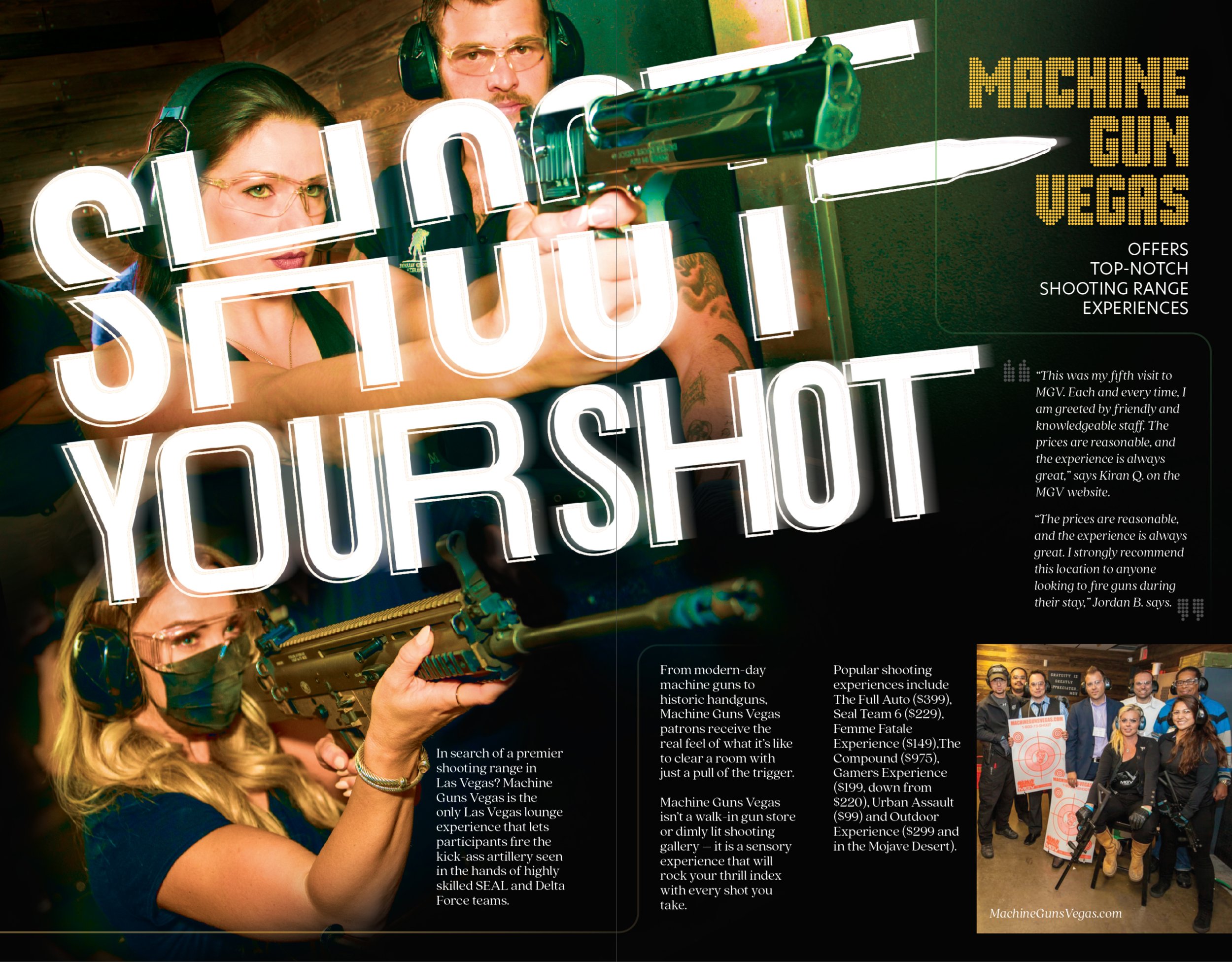
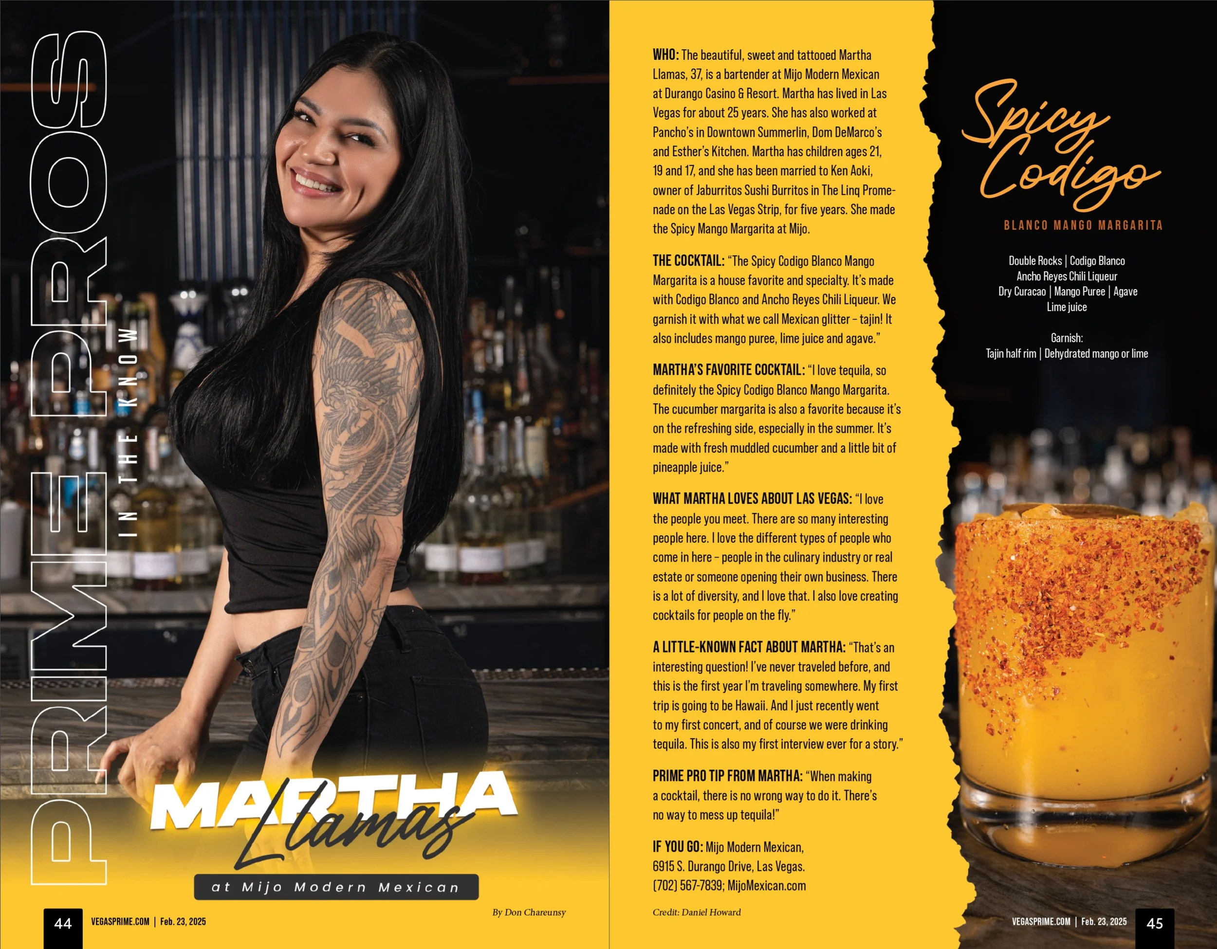
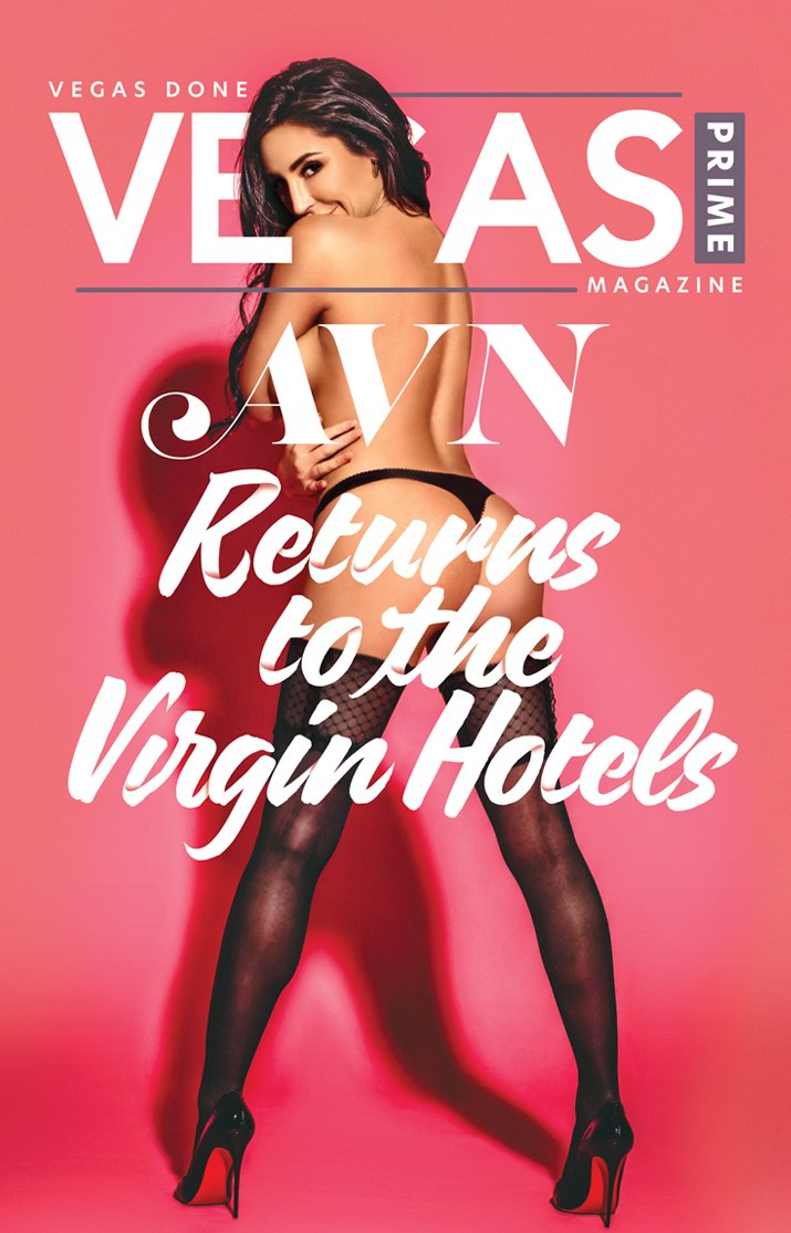
When I joined Vegas Prime Magazine as Art Director, I was tasked with a unique opportunity — designing the entire publication from the ground up. Despite it being my first full-scale magazine project, I approached the challenge with confidence, creativity, and a strong vision. From layout to typography, every page was crafted to capture the essence of the Vegas lifestyle and elevate the magazine’s visual identity.
Before diving into the magazine’s interior layout, the first priority was designing the logo. Logo design has always been a passion of mine, and knowing this mark would represent the publication week after week — in print and across the city — I set out to create something bold, versatile, and memorable. The goal was to design an identity that would not only stand out but also leave a lasting impression.
With no creative brief, no past issues to reference, and no clear direction, I had a completely blank slate to work from for what would become Vegas Prime Magazine.
I started by exploring typefaces that resonated with the vibe I envisioned, using them as the foundation to build the overall look and feel of the publication.
BOOM!
This is it! After so many concepts, this is the one.
I was proud, I started to practice my pitch. I was about to Don Draper this b*tch.
“The CEO doesn’t like it. Said the ‘g’ looked weird.”
…sh*t
After an initial concept didn’t hit the mark, I presented my backup logo — the "safe" option. It wasn’t as bold, playful, or memorable as the original, but it was solid and dependable. And sure enough, it was approved on the spot.
“Logo approved. Now it’s time to design the magazine”
*takes deep breath
I got this.

